Aug 29, 2025
PIER: Redesigning a Website to Strengthen Donor Engagement and Storytelling in Roatan
This case study addresses PIER's need to strengthen donor engagement and streamline site maintenance by conducting stakeholder interviews, usability testing, and competitive analysis to redesign its Zoho Sites platform with improved storytelling, simplified donation flows, and comprehensive documentation to support volunteer sustainability.

*Note: Some materials, including hi-fi prototype videos, interactive demonstrations, and detailed design documentation, are not embedded on this page due to Framer's limitations. For the complete case study with all assets and deliverables, please visit the official project documentation or view the full presentation.
About Nonprofit 💼
Partners in Education Roatan (PIER) is a nonprofit dedicated to empowering educators and improving learning outcomes across the island of Roatan. Their mission is to support teacher training, amplify local impact stories, and connect donors with meaningful giving opportunities.
We partnered with PIER to redesign their website on Zoho Sites, improving the donation experience, streamlining site maintenance, and enhancing storytelling to better connect with donors, board members, and volunteers. The redesign also supports PIER’s goal of creating a more polished, visually engaging platform that inspires confidence and encourages increased donations.
Project Objective 🌟
Partners in Education – Roatan (PIER) needed a website redesign to better highlight teacher impact stories, represent the island’s culture, and simplify a cluttered donation process for donors.
We created a storytelling-focused Zoho Sites platform with an improved Donorbox flow, intuitive navigation, ocean-inspired visuals, and detailed maintenance documentation so future volunteers can easily update and manage the site.
Project Demo Video 🎥
Link to Finished Project/Figma Prototype 🚀
https://www.figma.com/proto/SPCUfevjVdTCK2ucOOhynq/Partners-In-Education-Roatan--PIER-?node-id=3074-8412&t=VxjeMelYUwsc2CJj-1
Process 💭
1. Setting the Stage
Background Research
Research Goals:
Understand PIER’s primary audiences, especially donors, and what motivates them to give.
Identify pain points in the current website experience, especially around storytelling, donation flow, and content updates.
Assess the technical capabilities and constraints of PIER’s volunteer board for ongoing website maintenance.
Determine how to integrate cultural representation and organizational credibility into the site’s design and content.
Interviews
To better understand PIER’s goals, audiences, and challenges, we:
Conducted multiple weekly calls with Timna Varela, the executive director of Partners in Education – Roatan, to clarify project goals, audience priorities, and functionality needs.
Discussed the limitations and opportunities of the current Zoho Sites setup, including integration with Donorbox for payment processing.
Reviewed feedback from the board of advisors and donors on storytelling priorities, donation processes, and cultural representation.
Consulted internally with the design and engineering teams to align on feasibility, platform constraints, and user experience best practices.
Insights and Pain Points
Primary audience: Donors are the top priority, followed by educators and community members.
Storytelling gaps: Teacher stories, achievements, and program impact are underrepresented on the current site, limiting emotional connection with donors.
Donation flow issues: Repetitive donation prompts and a non-intuitive process reduce conversion likelihood.
Credibility needs: Board members, awards, and supporters are not prominently displayed, missing an opportunity to build trust.
Platform constraints: Zoho Sites is functional but has limitations in design flexibility and mobile optimization.
Volunteer turnover: Frequent changes in volunteer maintainers make ease of use and clear documentation essential for sustainability.
Content duplication/confusion: Legacy site content (on Bravenet) still appears online, creating inconsistency and confusion for visitors.
Brainstorming
To shape our design and feature recommendations, we looked at nonprofit websites with strong storytelling, clear donation flows, and active community engagement.
The Foundation for Education in Honduras (FEIH) – Highlights mission and programs up front, uses strong visuals, and integrates donation options into the homepage.
#TeachersCan – Focuses on campaigns and teacher stories with video, photos, and resource donation features.
Inspired Teaching – Offers a variety of content like podcasts, videos, and event calendars, though navigation could be more streamlined.
Teach For All – Uses clean navigation, clearly labeled sections, and a prominent donation button.
Room to Read – Maintains consistent branding, uses color to guide actions, and makes donation CTAs stand out.
We also pulled ideas from larger organizations like WWF and Save the Children, especially in how they handle donation buttons, impact storytelling, and cultural representation. Additional inspiration came from websites shared by our client, including Education Cannot Wait, Plan International, and World Vision International.
2. Project Scoping
Based on conversations with the client, taking into account EPIC India’s goals and needs from the product, and the PRD of highest priority features to implement, we created an initial sitemap to structure and lay out the pages we wanted to create, and 2 main user flows (volunteer signup and donation flows):
Core Features/Sitemap
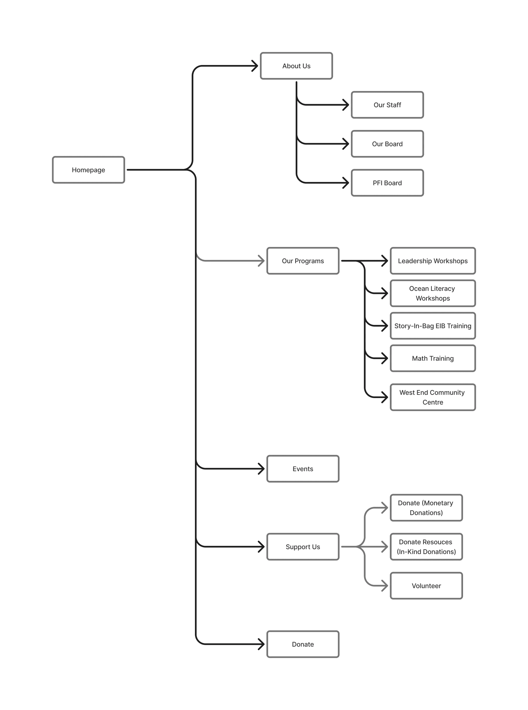
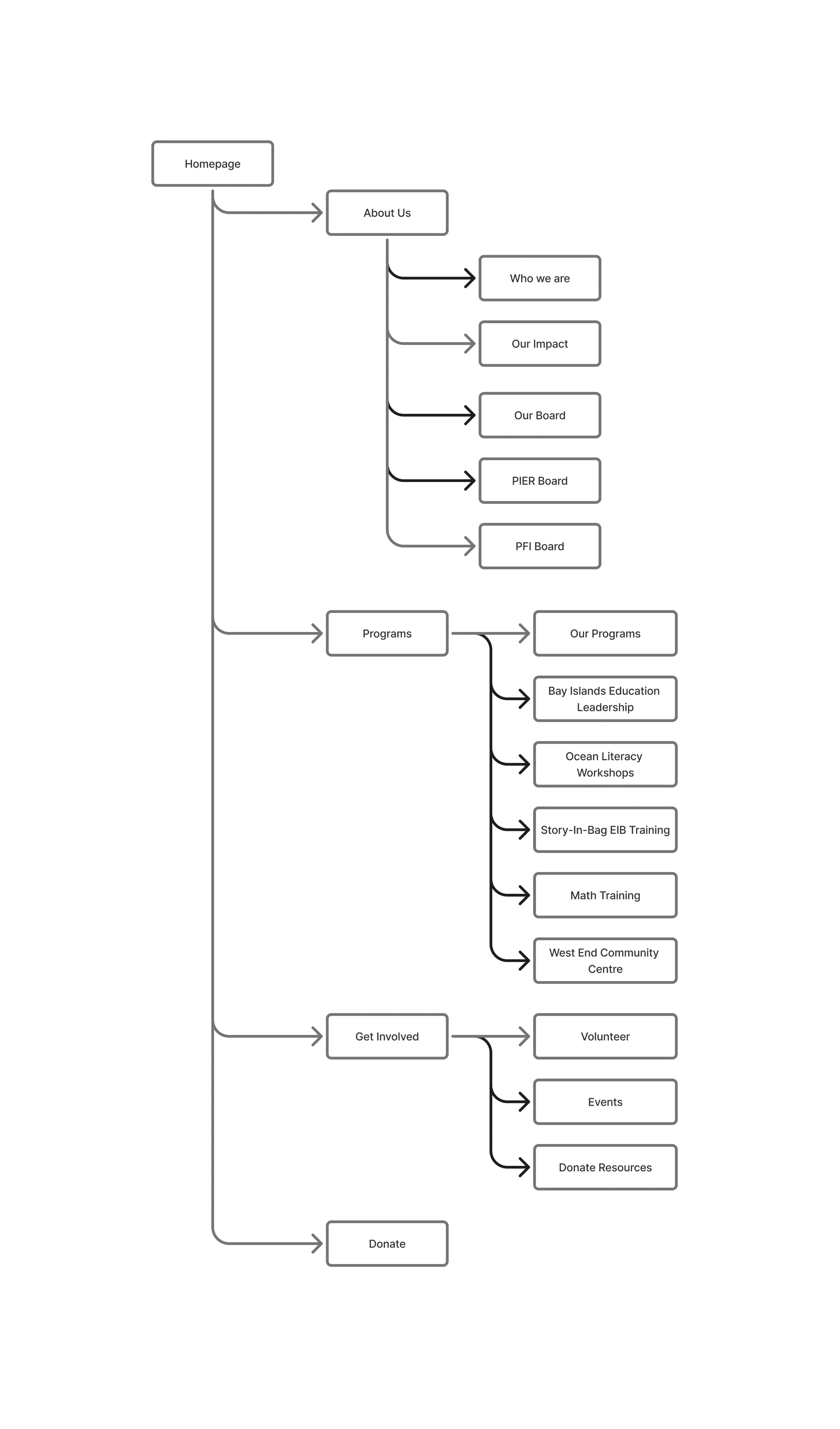
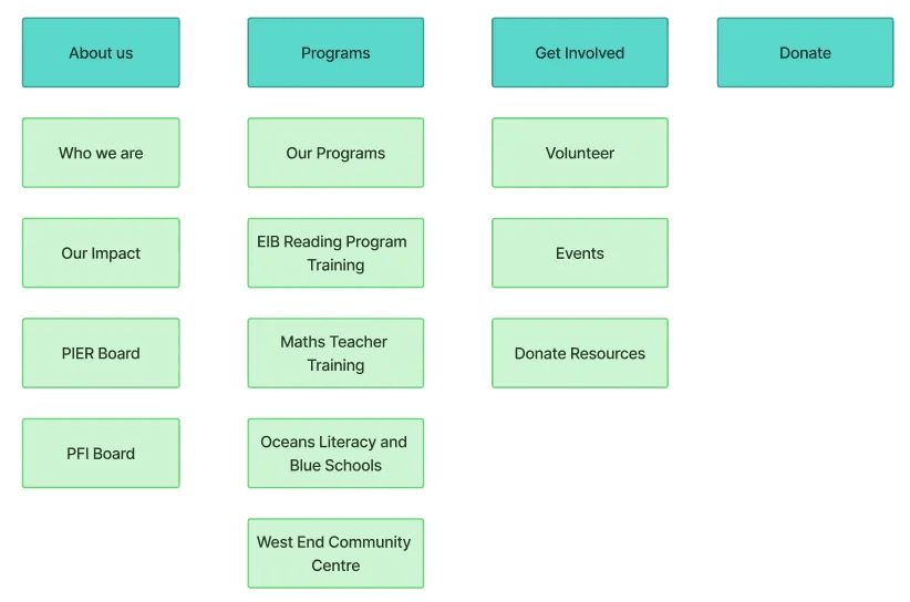
Initially, the sitemap was designed around four main navigation categories from the homepage: About Us, Programs, Get Involved, and Donate. Each category branched into multiple subpages to cover organizational information, program details, and opportunities for community involvement.
About Us included pages for Who We Are, Our Impact, Our Board, the PIER Board, and the PFI Board.
Programs contained an “Our Programs” overview and five individual program pages: Bay Islands Education Leadership, Ocean Literacy Workshops, Story-in-Bag EIB Training, Math Training, and the West End Community Centre.
Get Involved linked to Volunteer, Events, and Donate Resources pages, while Donate was a standalone call-to-action for contributions.
This structure provided breadth but required users to navigate multiple layers to reach key content and actions.
As we progressed, we refined the sitemap to streamline navigation, reduce redundancy, and make high-value actions more discoverable for donors and volunteers.
About Us was simplified to highlight Our Staff, Our Board, and the PFI Board, consolidating “Who We Are” and “Our Impact” content to reduce fragmentation.
Programs was renamed Our Programs and retained its five program pages, with “Bay Islands Education Leadership” updated to “Leadership Workshops” for clarity and consistency.
Get Involved was split into two distinct top-level navigation items: Events and Support Us.
Support Us became a centralized hub for all contribution options—monetary donations, in-kind donations, and volunteering—reducing the cognitive load on users deciding how to engage.
The Donate button remained a top-level navigation item to preserve immediate access for donors.
Design 🎨
Site Analysis
We began our design process with a comprehensive page-by-page review of the existing PIER website to identify strengths, weaknesses, and opportunities for improvement.
Key Findings:
The website is text-heavy and lacks engaging visuals; imagery and layout changes could improve storytelling.
Calls-to-action (CTAs) were often buried at the bottom of pages instead of being placed prominently above the fold.
Navigation requires too many clicks to reach key actions, creating friction for users.
Forms vary in design and layout, making the experience inconsistent.
Some page structures, like “Our Story” and “About PFI,” rely on long paragraphs that could be broken up for readability.
These insights guided early design decisions around information architecture, layout prioritization, and visual hierarchy.
User Personas
To ensure our redesign addressed the needs of PIER’s primary audiences, we developed two detailed user personas based on stakeholder interviews and research.
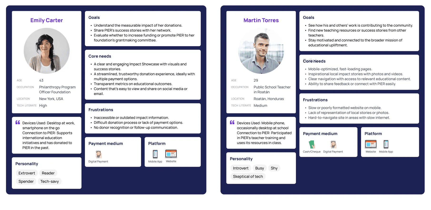
Emily Carter – A philanthropy program officer in the U.S. who values measurable impact, clear success stories, and a smooth, trustworthy donation process. Her frustrations include outdated impact information, difficult payment options, and lack of donor follow-up.
Martin Torres – A public school teacher in Roatán who seeks inspirational, locally relevant content and resources to use in his work. His frustrations include poor mobile optimization, lack of local representation, and slow site performance on limited internet.
These personas kept the team grounded in user priorities throughout the design and development phases, helping us frame decisions around real-world goals and pain points.
Competitive Analysis
Before moving into wireframing, we conducted a competitive analysis of similar nonprofit and education-focused organizations to understand how they approached storytelling, donation flows, and overall user experience. We reviewed organizations such as The Foundation for Education in Honduras, #TeachersCan, Inspired Teaching, Teach For All, and Room to Read.
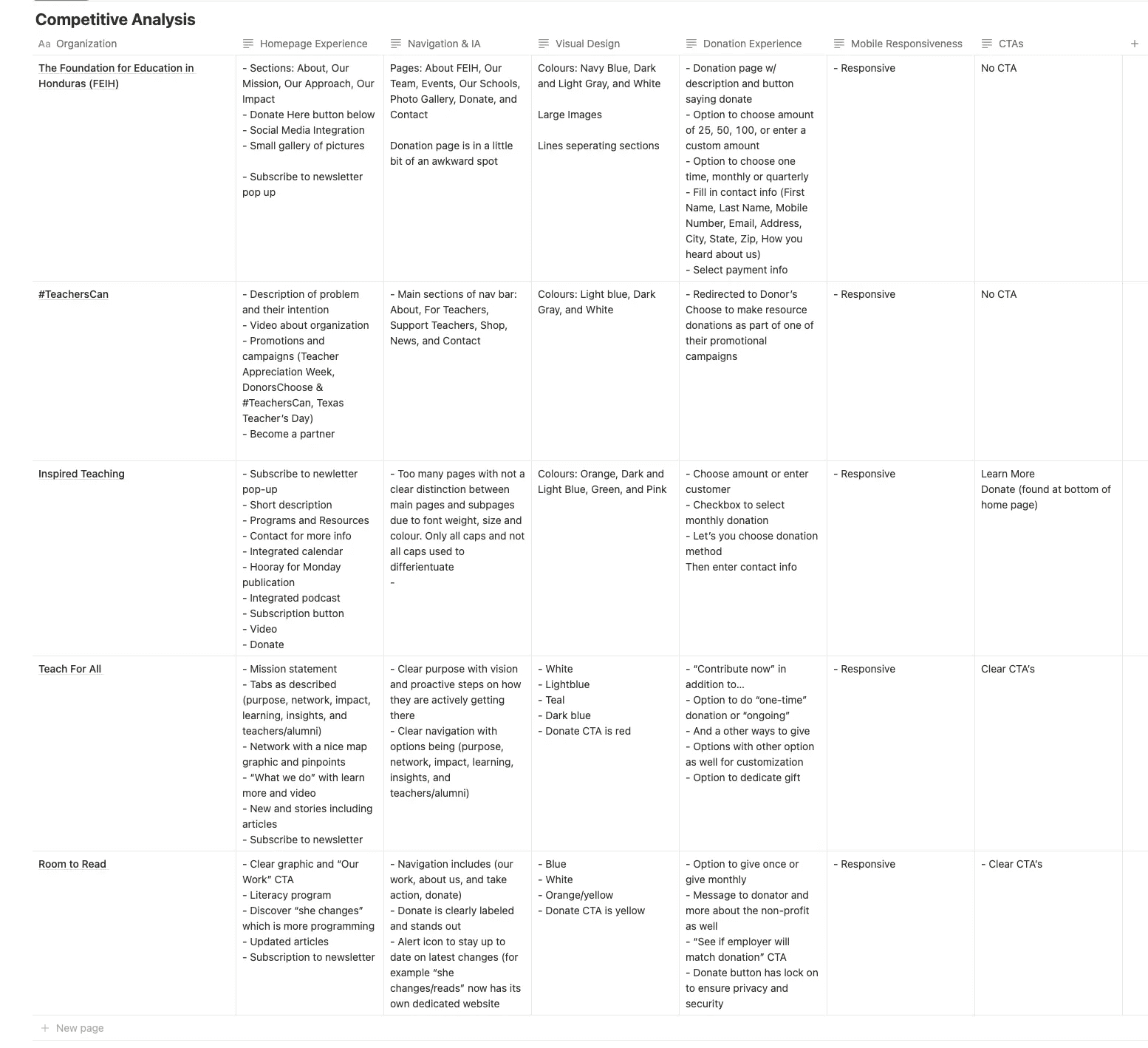
Our analysis compared homepage experience, navigation and information architecture, visual design, donation experience, mobile responsiveness, and calls-to-action.
Key Insights:
Clear Navigation Matters – The best sites clearly labeled their navigation menus, with minimal layers between the homepage and donation or engagement actions.
Strong Visual Hierarchy – High-impact images and concise text blocks kept users engaged and conveyed credibility quickly.
Donation Flow Optimization – Leading organizations streamlined their donation process, reducing the number of clicks and form fields before completing a gift.
Mobile Responsiveness is Essential – All high-performing sites were optimized for mobile, ensuring a smooth experience on smaller screens.
Consistent CTAs – Well-placed, visually distinct CTAs encouraged user action at multiple points throughout the site.
These observations directly influenced our approach to PIER’s redesign, particularly in simplifying navigation, prioritizing visuals over text-heavy sections, and making CTAs visible above the fold.
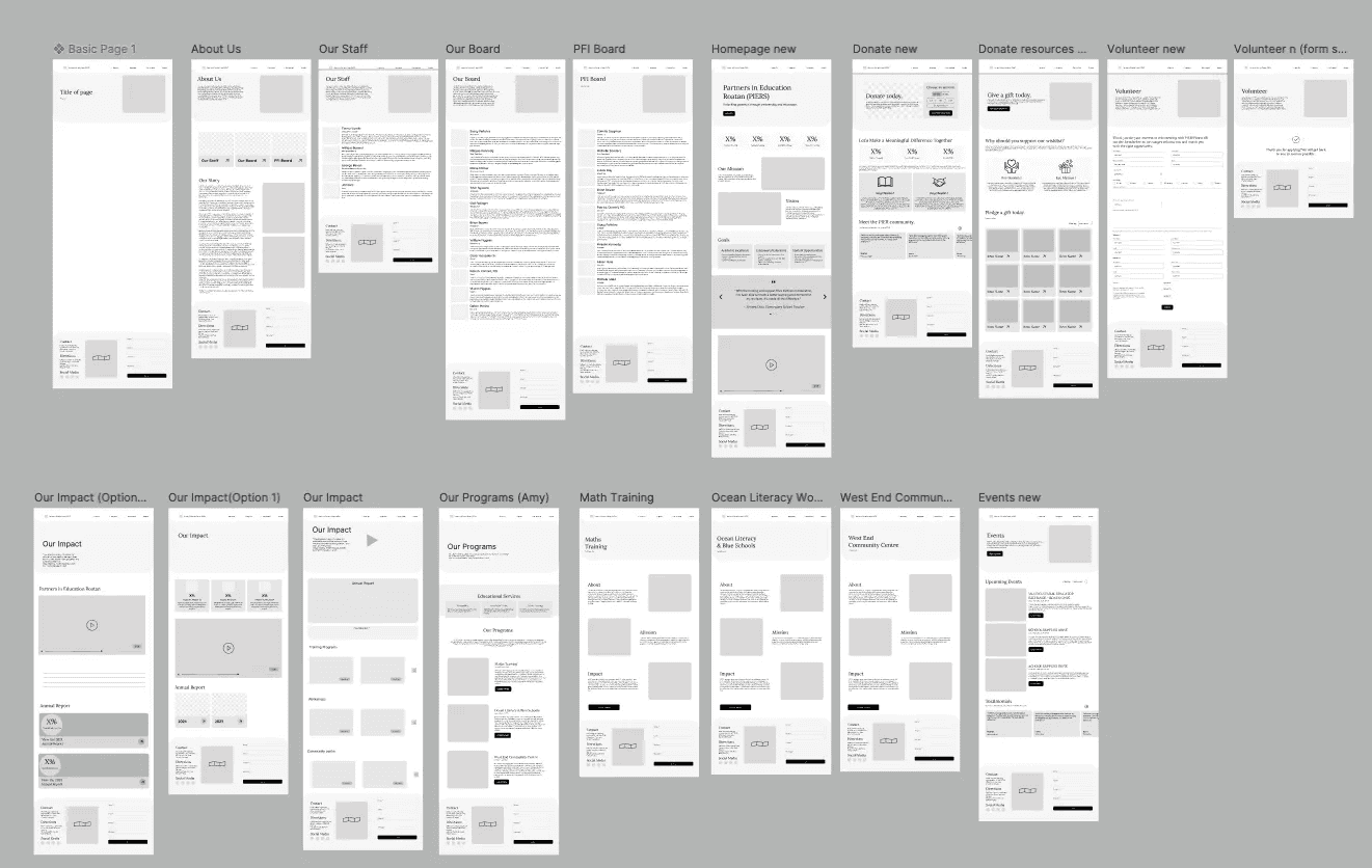
Wire-framing + LoFi Prototype
With the insights from our site analysis and personas in mind, we moved into wire-framing to explore new layouts, navigation patterns, and content hierarchy without being constrained by final visuals.
We sketched multiple variations of key pages, testing ways to:
Balance compelling storytelling with clear donation pathways.
Make calls-to-action more visible and intuitive.
Improve clarity in how program pages were structured and presented.
Using Figma, the team iterated on these wireframes, refining them based on internal feedback and early client input. This phase helped us decide which content should be prioritized above the fold, how to streamline navigation, and how to position donation opportunities for maximum engagement.
Here is a snapshot of the lo-fi wireframes created in Figma:
Testing
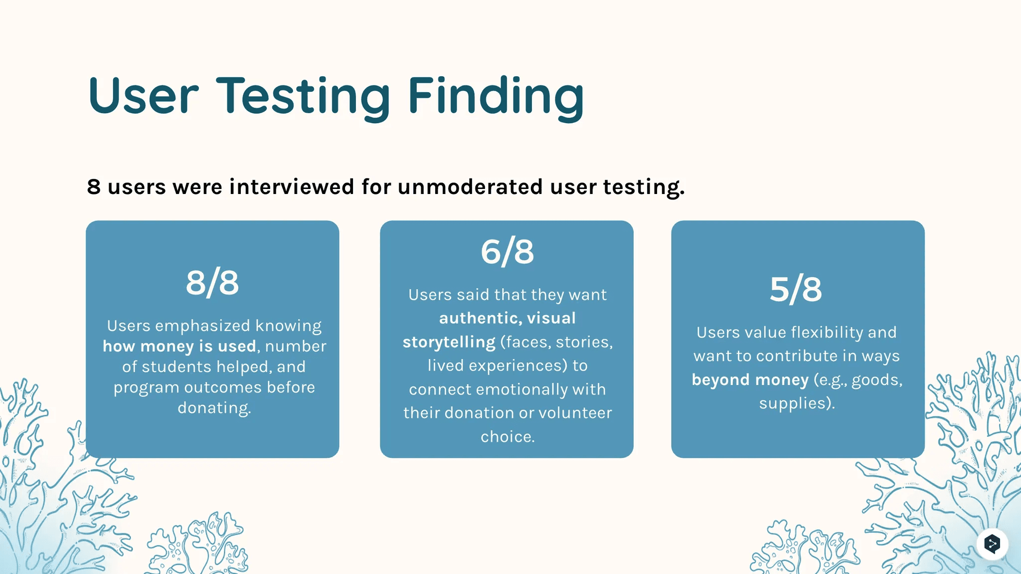
We conducted 8 moderated usability tests through UserTesting.com to evaluate the mid-fidelity prototype. The goal was to assess clarity, navigation, and alignment of content with user needs before moving to high-fidelity design.
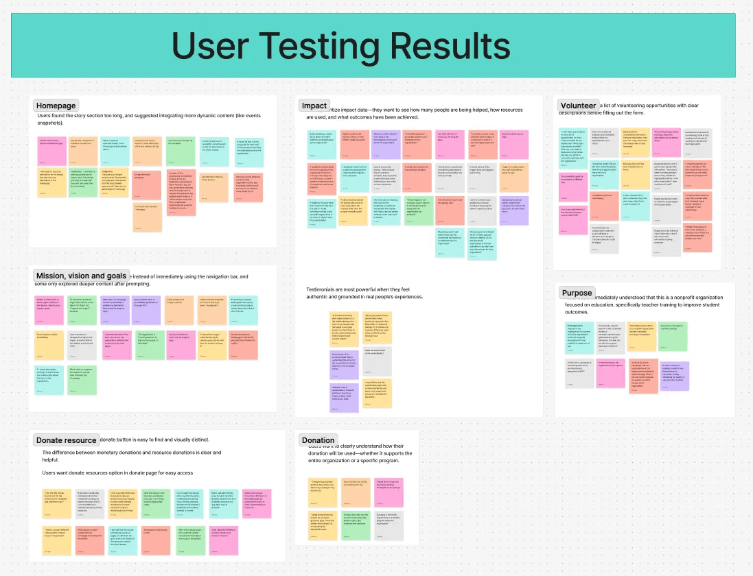
Homepage Clarity & Content Prioritization
Finding: Users found the homepage visually clean and accessible, with positive feedback on color contrast for color blindness. However, the mission and goals were visually overshadowed by large testimonials.
Iteration: Rebalanced homepage hierarchy—reduced testimonial prominence, elevated mission/goals section, and added concise intro copy.
Finding: Users wanted concrete data—numbers helped, like “how many students are helped” and “where funds go.” Donors looked for future goals and sustainability proof.
Iteration: Added impact metrics, annual report links, and a “Future Vision” section to the About page.
Media & Trust Signals
Finding: Users trusted the organization more when they saw authentic staff/volunteer photos and real moments.
Iteration: Replaced stock images with program photography and added short video snippets.
Donation Flow Improvements
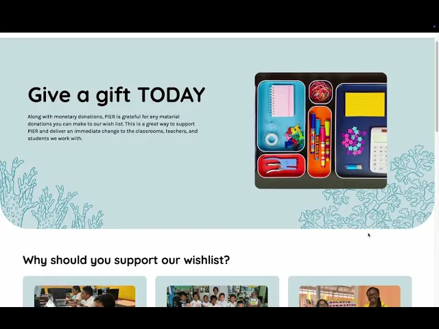
Finding: Monetary vs. resource donations were clear, but users wanted resource donation accessible from the Donate page. They also wanted to know exactly how donations would be used.
Iteration: Added “Donate Resources” button to Donate page, included clear allocation breakdowns, and linked to financial transparency documents.
Card Sorting
To refine the site’s navigation, we conducted a card sort exercise to understand how users naturally grouped content.
Our Impact was initially grouped under Programs, but users expected it under About Us.
Two donation entry points (Get Involved + Donate) created confusion.
Based on these insights, we moved Our Impact to About Us and streamlined donation into a single, clear pathway.
Handoff Documentation
To equip future volunteers with the resources needed to maintain and evolve the platform, the design team delivered a design maintenance document covering:
Figma project files containing finalized high-fidelity designs, component libraries, and style guides.
Figma interactive prototypes with clickable flows for each core page.
Style guide outlining brand colors, typography (Quicksand for headings, Karla for body text), spacing scales, and design tokens to ensure consistency.
Component library for reusable elements such as buttons, navigation, and cards—editing these automatically updates all linked instances.
Illustration library featuring approved icons and graphics in a flat, educational style with coral accents inspired by Roatán’s marine environment.
Instructions for safe content updates in Figma, including how to edit text, replace images, and maintain consistent typography styles.
Guidance on exporting assets in the correct formats (SVG for icons, PNG for images, PDF or PNG for full mockups).
Links to all assets and tools for easy access:
Final Figma Design File
Figma Interactive Prototype
By centralizing all design details, assets, and usage instructions, this documentation ensures that future volunteers can preserve PIER’s visual identity while allowing the site to evolve over time.
Development 💻
Our development work primarily took place within Zoho Sites, which PIER already used as its hosting and content management platform. Since Zoho Sites is a low-code/no-code builder, there was no need for extensive front-end or back-end programming. Instead, our engineering efforts focused on optimizing Zoho’s existing features, implementing sustainable editing workflows, and ensuring that future volunteers could easily maintain the site.
Platform Evaluation
Early in the process, we evaluated several potential platforms such as Zoho Sites, WordPress, and Webflow against PIER’s needs for usability, design flexibility, donation integration, and volunteer maintainabilityPlatform Comparison. While Webflow and WordPress offered more customization, Zoho Sites was selected for its integration with PIER’s existing suite, lower maintenance requirements for non-technical users, and cost-effectiveness. Our client also confirmed that she preferred to continue with Zoho Sites, reinforcing the decision
Key Development Work
Even within Zoho’s low-code environment, the team implemented a set of best practices and structural improvements to improve the editing process and avoid accidental disruptions:
Safe Editing Process – Created new pages in “Draft” or “Under Review” mode to ensure changes could be reviewed before going live.
Version Control – Made inactive “V2” copies of core pages (e.g., VolunteerV2) to stage updates without altering the live version
Menu Management – Built alternate menus (e.g., “defaultv2”) to link updated pages without disrupting the current navigation.
Content Editing Guidelines – Documented clear steps for updating images, adding testimonials, and editing page text to ensure consistency.
Header/Footer Management – Avoided editing the global header until final stages to prevent site-wide disruptions.
Access & Security – Recommended enabling two-factor authentication for editors and updating shared passwords after the project handoff.
Handoff Documentation
To set future volunteers up for success, the engineering team delivered a Zoho-specific technical guide covering:
How to update and upload images
How to edit text content across the site
How to add testimonials and new pages
How to stage updates safely before publishing
How to modify navigation menus
This focus on workflow, documentation, and training ensures that PIER can sustain and evolve its website without requiring ongoing developer involvement.
Results 💯
Our team successfully redesigned PIER’s website on Zoho Sites to create a more polished, user-friendly platform that highlights teacher impact stories, simplifies the donation flow, and ensures easy updates for future volunteers. Down the line, this redesign will help PIER sustain donor engagement, strengthen its storytelling, and support long-term growth in funding for educational programs in the Bay Islands.
Testimonials 📩
Client Testimonials
Overall impression: The client described the new site as fresh, organized, and easy to navigate. They emphasized how the design shifts education away from feeling “boring” to something engaging and approachable.
“My first impression of the website is very positive. It feels organized, fresh, and smooth to navigate, making it easy for visitors to find what they are looking for. The design breaks away from the idea of education being a ‘boring’ subject—it feels dynamic, engaging, and approachable.”
Most impactful feature: The presentation of PIER’s work stood out the most, especially how the design highlights island heritage while keeping the storytelling concise and donor-friendly.
“The most impactful element is how the scope of our work is presented. The design highlights our island heritage while sharing our efforts in a concise and visually appealing way. This helps visitors clearly understand where our focus lies and what donors would be supporting.”
Future value: The client noted the site will help them build stronger connections with donors, volunteers, and staff by clearly communicating their identity and opportunities for engagement.
“The new site will help us connect more effectively with donors, volunteers, and staff by presenting who we are in a clear and friendly way. It is easier for people to get to know us, explore opportunities for collaboration, and see how they can engage with our programs.”
Final reflection: They felt the site now fully represents PIER’s mission and identity, making it easier to inspire support.
“The site truly captures our essence. It communicates who we are, what we do, and why we invite others to support us. It reflects both our mission and identity, making it easier to inspire others to join us in our work.”
User Testimonials
Users praised the updated site design, noting the prominent placement and accessibility of the donate button, as well as the overall clarity of calls-to-action.
Accessibility also received positive feedback, with a color-blind user reporting no trouble differentiating colors throughout the site.
“I like the color. Since I am color blind, I have no trouble distinguishing elements on the site.”
“The donate button is clearly visible at the top of the page, highlighted in a different color, and always present in the navigation.”
“There are multiple well-placed calls-to-action, and the donate button is easy to locate.”
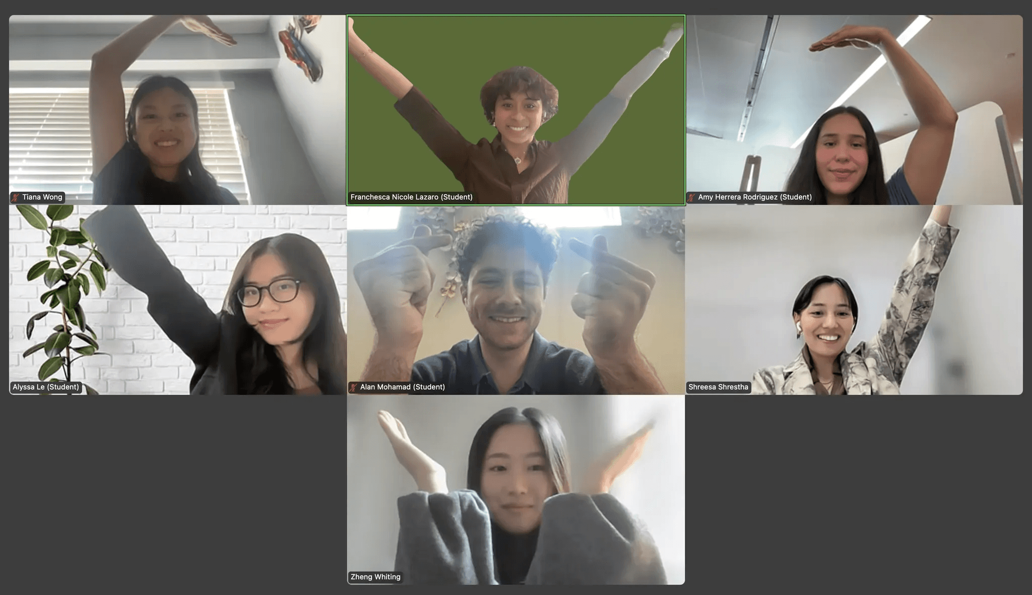
Meet the Team 💌
Product Manager: Franchesca Nicole Lazaro Technical Product Manager: Alyssa Le
Developers: Whiting Zheng, Alan Mohamad
Designers: Tiana Wong, Amy Rodriguez, Shreesa Shrestha, with Whiting Zheng and Alan Mohamad assisting on low-fi designs